How to create unforgettable member journeys (and avoid forgettable ones) – PART 1.
As the saying goes when it comes to staying healthy and fit, you are what you eat. Put another way, what you input heavily influences the output.
In a way, this isn’t dissimilar to membership organisations. After all, the health of a membership organisation – and by healthy in this context we mean happy members – is increasingly dependent on the quality, structure and functionality of its CRM system.
So, get the CRM system experience right (the input) and the output will be a happy membership and a healthy membership organisation.
Why, then, do some membership organisations continue to get this bit wrong? To address this, we’ve prepared a three-part guide to getting the most from the member journey, which we’ll publish over the coming weeks.
Part 1 – the ‘join journey’
As an association, trade union or professional body, you’ll know that there are countless reasons why people choose to join a membership organisation.
From becoming part of a community and networking opportunities, to CPD and skills development, there are multiple motivators. From the organisation’s perspective, of course, a continuous stream of new members – and therefore new revenue – is key to growth.
No second chance to make a first impression
When it comes to getting people to commit to parting with their money on a long-term basis, simplicity is key – as is getting it right the first time. After all, you might not get a second chance.
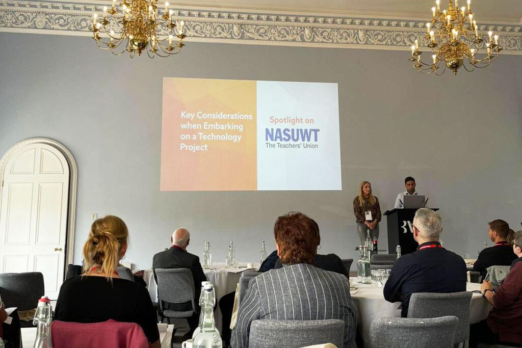
During a recent MemberWise webinar, our Head of Product at Millertech, Steven Shiels, identified four key areas that existing and prospective users want when engaging with a membership organisation:
- Simplicity
It has to be easy – not onerous – for incoming users to navigate. If they’re scratching their heads at any point during the process, and certainly before they’ve committed to a subscription, then your join journey may need a rethink.
- Multiple, optional, cross-site routes
Users need to be able to quickly find what they need and have multiple ways of getting there, too.
- Good use of labelling
Similar to point 2, signposting is key and this means that the user requires less brainpower and legwork to get to where they need to go
- Intuitive search and findability
In this day and age, intuitive navigation is expected by most users – regardless of whether they’re using a CRM system or a mobile phone. Make sure that your sign-up page is intuitive – even if the rest of your site is less so.
A for effort
Take NASUWT, the trade union for teachers, for example. Not only does it happen to be a Millertech customer, but its join journey is clear, straightforward and easy to use. Firstly, there are three opportunities to join on the homepage alone. Then, when you click ‘Join’, everything you need to know to make a decision is presented to you front and centre, the result of which should leave no doubt in the prospect’s mind as to why they should join and the benefits they’ll enjoy as a member. There’s even the opportunity to participate in a free trial for six months, which acts as a further incentive.
Then you’re guided through a process that’s signposted from the outset. This highlights what is going to happen within the join journey so that even before you embark on the process, you’re already aware of what’s involved. Nothing is hidden, everything is clear – and this needs to be replicated across all devices.
NASUWT did this extremely well and their signposting provided the following valuable information:
- Specific guidance aimed at providing clarity; for example, stating that it’s okay to give a rough estimate of the date they qualified rather than being exact.
- A completion form that shares a similar format with the questionnaire – as opposed to a data entry form – which adds the human touch.
- Mandatory fields that are clearly signposted and a journey that adapts based on the answers provided.
- The ability to leave the journey and save inputted information at any point and return to it at a later stage.
- A traffic light system that illustrates how far in the process you are.
Of course, sometimes multiple clickthrough’s and pages are required. However, in this scenario, they made sure to design it in a way to capture the prospective member’s email address early on. In doing so, it enabled NASUWT to leverage their automated processes by providing the ability to reach out to the prospect at a later date in the event that they changed their mind part way through applying.
Keep it simple
In order to maximise the join journey and increase the chances of acquiring new members, it needs to be a seamless and positive experience from the moment they land on your website to the point at which they’ve joined your organisation.
But that’s only the start of the journey. Find out about how to get your new member’s journey off to a flying start in Part 2 – optimising onboarding.
Looking to solve membership for your trade union, professional body or non-profit? Contact Millertech here.


